Wednesday, December 26, 2012

Christmas Nights into Dreams

Developer: Sonic Team
Publisher:  Sega

Released as a free demo with the purchase of Saturn exclusives back in '96, there was a time when Christmas Nights into Dreams' online pricing and demand surpassed that of many full fledged titles.
The demo opens up with a motion comic style intro. Interestingly enough, the narrator sounds bored and uninterested in her text. I'm guessing Sega noticed this too as the 2012 Steam release changed narrators. The story, or what little there is of it has our silent protagonists trying to find a Christmas star containing all of the spirit of the holidays. Yes, 'plot' (and I use this term loosely) is nonsensical but narrator issues aside, it establishes the mood required for this style of game.

The demo consists of two levels, the latter being a boss fight. However, Christmas Nights Into Dreams detects your Saturn's clock setting, and on December 25th, levels shift radically to a holiday setting. Once green mountains are now fully covered in snow, decorated with Christmas trees, stars and other decorations, even the soundtrack changes to a beautiful rendition of Jingle Bells. With that said, the boss fight seems disconnected from Night Into Dreams' overall theme. While the background graphics were changed and decorated with presents, the background music and boss design seems out of place.
Apart from the two short levels you'll find an assortment of unlockables. A lot of it is mere filler content like
poorly aged mid 90s CGI renditions of our main characters, or karaoke songs allowing you to change the pitch of the singers. The most interesting unlockable content is Sonic mode, in which players traverse through each level as the lovable hedgehog. Even the gameplay changes accordingly, but this was clearly an afterthought as the camera struggles to keep up with Sega's mascot.
Rating Christmas Nights into Dreams would be a disservice to the amazing work the developer put forth. It's easy to forget this is a short 10 minute demo with a few extras thrown in. Sonic Team's love and dedication shines through, it transforms what would have been a simple demo into an experience that not only promotes the full-fledged release but even adds a spin to the formula. I'll be the first to admit to prefer Christmas Nights into Dreams' art-style over the final game, as I find myself returning to this edition more often than I do the regular one.

Trivia: Did you know that despite its name, Christmas Nights into Dreams also changes themes on other occasions? During New Year, you get a 'Happy New Year' message, on Valentine's Day you get a Valentine's Hearts and on April 1st you play as the series' main antagonist.

Pros:
- A normal demo for most of the year, but on certain dates it throws you some nice curve balls
- Beautiful rendition of Jingle Bells
- I'd argue the demo has a better art style then the actual game
- The motion comic style intro and ending adds to the demo's whimsical nature

Cons:
- It's just a demo, so you'll be done with it in 10 minutes
- The unlockables are really not worth the time
- Why does the Narrator sound so bored?
- How many times have I said 'Christmas' in the review? Somebody make a drinking game out of that!

Final Grade: N/A

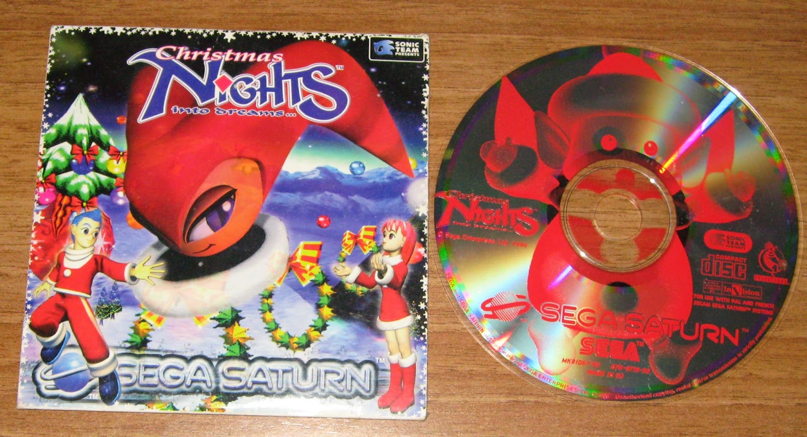
Christmas Nights into dreams comes in a humble cardboard sleeve. The cover is thematically appropriate, featuring our main characters decked in red winter gear with the newly decorated Spring Valley level behind them. The CD design isn't nearly as appealing, it relies on the imps' cuteness factor but I feel this decision didn't quite pan out as Sega hoped. 

Due to the game's small, unassuming package, chances are Christmas Nights into Dreams will blend in with the background. It's easy to lose or misplace the game, and it's unlikely it will ever serve as a conversation piece by itself. Much like the game itself, it would be a disservice to attribute a score to Christmas Nights into Dreams' packaging, considering this a demo, Sega already went above and beyond the call of duty.

Packaging Grade: N/A

Christmas Nights into Dreams (Christmas Special)

Developer: Sonic Team
Publisher:  Sega

Released as a free demo with the purchase of Saturn exclusives back in '96, there was a time when Christmas Nights into Dreams' online pricing and demand surpassed that of many full fledged titles.
The demo opens up with a motion comic style intro. Interestingly enough, the narrator sounds bored and uninterested in her text. I'm guessing Sega noticed this too as the 2012 Steam release changed narrators. The story, or what little there is of it has our silent protagonists trying to find a Christmas star containing all of the spirit of the holidays. Yes, 'plot' (and I use this term loosely) is nonsensical but narrator issues aside, it establishes the mood required for this style of game.

The demo consists of two levels, the latter being a boss fight. However, Christmas Nights Into Dreams detects your Saturn's clock setting, and on December 25th, levels shift radically to a holiday setting. Once green mountains are now fully covered in snow, decorated with Christmas trees, stars and other decorations, even the soundtrack changes to a beautiful rendition of Jingle Bells. With that said, the boss fight seems disconnected from Night Into Dreams' overall theme. While the background graphics were changed and decorated with presents, the background music and boss design seems out of place.
Apart from the two short levels you'll find an assortment of unlockables. A lot of it is mere filler content like
poorly aged mid 90s CGI renditions of our main characters, or karaoke songs allowing you to change the pitch of the singers. The most interesting unlockable content is Sonic mode, in which players traverse through each level as the lovable hedgehog. Even the gameplay changes accordingly, but this was clearly an afterthought as the camera struggles to keep up with Sega's mascot.
Rating Christmas Nights into Dreams would be a disservice to the amazing work the developer put forth. It's easy to forget this is a short 10 minute demo with a few extras thrown in. Sonic Team's love and dedication shines through, it transforms what would have been a simple demo into an experience that not only promotes the full-fledged release but even adds a spin to the formula. I'll be the first to admit to prefer Christmas Nights into Dreams' art-style over the final game, as I find myself returning to this edition more often than I do the regular one.

Trivia: Did you know that despite its name, Christmas Nights into Dreams also changes themes on other occasions? During New Year, you get a 'Happy New Year' message, on Valentine's Day you get a Valentine's Hearts and on April 1st you play as the series' main antagonist.

Pros:
- A normal demo for most of the year, but on certain dates it throws you some nice curve balls
- Beautiful rendition of Jingle Bells
- I'd argue the demo has a better art style then the actual game
- The motion comic style intro and ending adds to the demo's whimsical nature

Cons:
- It's just a demo, so you'll be done with it in 10 minutes
- The unlockables are really not worth the time
- Why does the Narrator sound so bored?
- How many times have I said 'Christmas' in the review? Somebody make a drinking game out of that!

Final Grade: N/A

Christmas Nights into dreams comes in a humble cardboard sleeve. The cover is thematically appropriate, featuring our main characters decked in red winter gear with the newly decorated Spring Valley level behind them. The CD design isn't nearly as appealing, it relies on the imps' cuteness factor but I feel this decision didn't quite pan out as Sega hoped. 

Due to the game's small, unassuming package, chances are Christmas Nights into Dreams will blend in with the background. It's easy to lose or misplace the game, and it's unlikely it will ever serve as a conversation piece by itself. Much like the game itself, it would be a disservice to attribute a score to Christmas Nights into Dreams' packaging, considering this a demo, Sega already went above and beyond the call of duty.

Packaging Grade: N/A

Christmas cheer rating: 

Honestly, this is probably the most Christmas-y game I've played yet. The music is beautiful and the new backgrounds actually look more aesthetically pleasing than the original. I like that the objective isn't to recover presents, save Santa or any other materialist/commercial aspect of the Holiday. Instead, you're trying to find a magic star and restore everyone's Christmas cheer. Bad narrator aside, there's a lot of heart in this game. Five snowmen out of Five.


Friday, December 21, 2012

Christmas Special

A list dedicated to Christmas themed games or games that take place during Christmas.
NameChristmas RatingScorePackaging
Yakuza 21/5A-C+
Yakuza0.5/5B-B+
Christmas Nights into Dreams5/5N/AN/A
Jack in the Dark2.5/5N/AN/A

Christmas Special

A list dedicated to Christmas themed games or games that take place during Christmas.
NameChristmas RatingScorePackaging
Christmas Nights into Dreams5/5N/AN/A
Jack in the Dark2.5/5N/AN/A
Yakuza0.5/5B-B+
Yakuza 21/5A-C+

Christmas Special

A list dedicated to Christmas themed games or games that take place during Christmas.
NameChristmas RatingScorePackaging
Christmas Nights into Dreams5/5N/AN/A
Jack in the Dark2.5/5N/AN/A
Yakuza 21/5A-C+
Yakuza0.5/5B-B+

Halloween Special

A list dedicated to scary games or Halloween themed games.
NameScarynessHalloween FeelScorePackaging
Deathsmiles1.5/55/5A+B+
Castlevania Bloodlines1.5/53.5/5B+
Fatal Frame/Project Zero3.5/53/5BB-
Darkseed2.5/52.5/5D+A-
Splatterhouse2/53.5/5DC

Halloween Special

A list dedicated to scary games or Halloween themed games.
NameScarynessHalloween FeelScorePackaging
Castlevania Bloodlines1.5/53.5/5B+B
Darkseed2.5/52.5/5D+A-
Deathsmiles1.5/55/5A+B+
Fatal Frame/Project Zero3.5/53/5BB-
Splatterhouse2/53.5/5DC

Halloween Special

A list dedicated to scary games or Halloween themed games.
NameScarynessHalloween FeelScorePackaging
Deathsmiles1.5/55/5A+B+
Splatterhouse2/53.5/5DC
Castlevania Bloodlines1.5/53.5/5B+B
Fatal Frame/Project Zero3.5/53/5BB-
Darkseed2.5/52.5/5D+A-

Halloween Special

A list dedicated to scary games or Halloween themed games.
NameScarynessHalloween FeelScorePackaging
Fatal Frame/Project Zero3.5/53/5BB-
Darkseed2.5/52.5/5D+A-
Splatterhouse2/53.5/5DC
Castlevania Bloodlines1.5/53.5/5B+B
Deathsmiles1.5/55/5A+B+

Jack in the Dark

Developer: Infogrames
Publisher:  Infogrames/Interplay
Played on: Alone in the Dark: The Trilogy

Jack in the dark was a short promotional game/teaser for Alone in the Dark 2, its theme is a strange mix of Halloween and Christmas, in which you play as Grace Saunders, a young girl who was out trick or treating and enters a toy store that is apparently haunted, as all of the toys come to life, kidnap Santa Claus and want to kill you (Am I the only one getting a Nightmare Before Christmas vibe?).

The game plays as a survival horror, in fact, being a teaser for Alone in the Dark 2, it was probably to second game in the genre to have ever been created (that is, if you only count the standard formula for the genre). 

Unlike the first Alone in the Dark, here there is no combat, the game focuses entirely on puzzle solving which is an odd thing considering Alone in The Dark 2 was almost exclusively focused on combat, but the problem here is that even though this is just a short 5-15 minute game, a lot of the puzzles require quite a bit lot of lateral thinking, seriously, how I was supposed to know you have to feed candy to the jack in the box and THEN show him his reflection?

If you've played the old Resident Evil games you're probably familiar with the concept of 'tank controls' which is the perfect way to describe how it feels like when controlling Grace, she's a slow walker, slow turner, it's a pain to get her to sprint, even the act of investigating nearby items requires you to enter a menu, choose your option and then leave said menu.

Graphically the game doesn't look too hot, every character is made out of a few flat shaded 3D polygons whereas the backgrounds are 2D animations, possibly pre-rendered, if you're going to play this on Dos-box, I recommend you fiddle with the options and add some Anti-Aliasing.

There's only one song in the game and it's constantly repeating, though it's pretty Christmas-y in the mood it sets, however, I always found it interesting that if you turn the music off, it suddenly feels like you went from a Christmas themed game, to a scary Halloween themed one.

Overall Jack in the Dark is an interesting 'game' it's not a demo of Alone in the Dark 2 but neither is it really a game, it's part Christmas and part Halloween so if nothing else I can say it's an interesting title, a shame for its obtuse puzzles and controls.

Pros:
- Interesting mix of Christmas and Halloween themes
- A piece of gaming history

Cons:
- Not really a game, not really a demo
- Tank-like controls are a pain
- Some of the puzzles require a bit of Moon-logic

Final Grade: N/A

Packaging Review: This game was played using the 'Alone in the Dark: The Trilogy' compilation

Jack in the Dark (Christmas Special)

Developer: Infogrames
Publisher:  Infogrames/Interplay
Played on: Alone in the Dark: The Trilogy

Jack in the dark was a short promotional game/teaser for Alone in the Dark 2, its theme is a strange mix of Halloween and Christmas, in which you play as Grace Saunders, a young girl who was out trick or treating and enters a toy store that is apparently haunted, as all of the toys come to life, kidnap Santa Claus and want to kill you (Am I the only one getting a Nightmare Before Christmas vibe?).

The game plays as a survival horror, in fact, being a teaser for Alone in the Dark 2, it was probably to second game in the genre to have ever been created (that is, if you only count the standard formula for the genre). 

Unlike the first Alone in the Dark, here there is no combat, the game focuses entirely on puzzle solving which is an odd thing considering Alone in The Dark 2 was almost exclusively focused on combat, but the problem here is that even though this is just a short 5-15 minute game, a lot of the puzzles require quite a bit lot of lateral thinking, seriously, how I was supposed to know you have to feed candy to the jack in the box and THEN show him his reflection?

If you've played the old Resident Evil games you're probably familiar with the concept of 'tank controls' which is the perfect way to describe how it feels like when controlling Grace, she's a slow walker, slow turner, it's a pain to get her to sprint, even the act of investigating nearby items requires you to enter a menu, choose your option and then leave said menu.

Graphically the game doesn't look too hot, every character is made out of a few flat shaded 3D polygons whereas the backgrounds are 2D animations, possibly pre-rendered, if you're going to play this on Dos-box, I recommend you fiddle with the options and add some Anti-Aliasing.

There's only one song in the game and it's constantly repeating, though it's pretty Christmas-y in the mood it sets, however, I always found it interesting that if you turn the music off, it suddenly feels like you went from a Christmas themed game, to a scary Halloween themed one.

Overall Jack in the Dark is an interesting 'game' it's not a demo of Alone in the Dark 2 but neither is it really a game, it's part Christmas and part Halloween so if nothing else I can say it's an interesting title, a shame for its obtuse puzzles and controls.

Pros:
- Interesting mix of Christmas and Halloween themes
- A piece of gaming history

Cons:
- Not really a game, not really a demo
- Tank-like controls are a pain
- Some of the puzzles require a bit of Moon-logic

Final Grade: N/A

Packaging Review: This game was played using the 'Alone in the Dark: The Trilogy' compilation 

Christmas cheer rating: 

The game's Christmas theme feels a bit slapped on, remove the cheerful music, Santa and the Christmas tree outside the toy shop and instead you get a Halloween game, though the ending does feel like something you'd expect from a Christmas game, but everything else is just skin deep. Two and a half snowmen out of five.


Wednesday, December 19, 2012

Colony Wars Red Sun

Developer: Psygnosis
Publisher:  Psygnosis

The final entry in the Colony Wars series is quite a departure from its predecessors. Gone are the multiple mission paths, the series' extreme difficulty, heck, even the war between the League of Free worlds and the Colonial Navy takes a backseat to a new story arch in this game.

You play as Valdemar, a miner turned mercenary thanks to a ghostly figure known only as the 'General', apparently your character is humanity's last hope though the game never bothers to explain why your character was picked, in fact, it doesn't bother to explain much of anything really, this time around there are dozens of factions, the police, crime gangs, ruthless and corrupt companies and a slew of alien species who's relations with the League and the Navy are never really made clear, while I appreciate the fact that the developers tried to expand the lore in Colony wars: Red Sun, I felt that it only made it more confusing while downgrading the importance and scale of the series' main factions.

The game's plot is basically non-existent, you have interesting characters, but there's nothing for them to actually do, this sparks a pretty big contrast with its predecessor, Colony Wars: Vengeance, which had a great story, but no real characters.

The gameplay changed quite a bit as well, the ships handle a lot better and the enemy capital vessels no longer feature their cheap rays of death that never miss the target, instead featuring several guns and cannons that can be destroyed individually, you're also able to buy your own weapons and ships, unfortunately, for each step forward you'll find in this game, there's a step back to counterbalance it, for starters, there's a lot less mission variety, most of the missions consist of either guarding something or destroying something, you accept missions by signing contracts with different factions, but there's no repercussions with any of missions you accept, you can accept a mission by the space mafia followed by one offered by the space police and neither faction will care, you'd think at least one of them would refuse to hire you if you pissed them off.

I also found the game to be too easy, so easy in fact that I got bored fairly quickly after I started playing this and by the time I reached the game's midway point my ship was practically a flying behemoth of death. I think I only died once, during the last mission, but even then you can just restart it without any repercussions, which again, makes the game too easy and boring.

Graphically Colony Wars: Red Sun looks absolutely stunning, the textures, the ships, the effects all look great for a PS1 game, the only flaws I found were the capital ships who were quite a bit smaller in this game and the short draw distance during the ground missions. The orchestral soundtrack is pretty awesome as well, fitting the game's mood pretty well, though the songs repeated a bit too often for me.

Overall, Red Sun should have been the grand finale, the best of the series and in many ways it surpasses its predecessors, but these improvements are mostly cosmetic, the poor mission variety, the 'so easy it's boring' gameplay and the underdeveloped freedom and plot makes this game a disappointing ending to the series.

Trivia: Did you know that Colony Wars: Red Sun was created by a different studio than the first two games?

Pros:
- Graphically the game looks superb for a PS1 game
- Great orchestral soundtrack
- Your ship is pretty customizable
- Enemy capital ships no longer have that cheap ray of death
- The snarky characters are pretty interesting if a bit cheesy
 
Cons:
- Alternate path system was completely ditched
- There's no real plot to this game
- Extremely low difficulty curve makes for a pretty boring game
- The expanded lore is both confusing and underdeveloped
- Doesn't feel like a Colony Wars game at all

Final Grade: C

The cover looks pretty good, you see the Red Sun ship in the distance with a looming figure of Valdemar in the background, sure the image itself is just one big cliché, but it's a cliché that works.

As for the 30 page manual, it's... okay, it starts with a bit of cryptic and pseudo-deep dialog that sounds important but is really just pointless padding, it does however go into great detail on how to play the game, though I'd say too much detail a lot of the information there just isn't needed at all, with that said, I do like how it goes to the trouble of describing every weapon in the game, that's actually pretty useful, it also tells what you need to do to rank up in the game something which the game itself never really made it very clear.

Overall, it's a pretty good packaging, good artwork and a pretty decent manual, though I'd have liked if the manual gave you some backstory or if at least tried to fill some of the holes in the new expanded lore

Packaging Grade: B-

Monday, December 17, 2012

Colony Wars Vengeance

Developer: Psygnosis
Publisher:  Psygnosis

Launched just one year after the first game, no would blame you if you expected Colony Wars Vengeance to be a rehash of the original title, but believe me when I tell you this is not the case at all, the people at Psygnosis must've all been wizards because Vengeance is an improvement on almost every level (keyword: Almost).

An unspecific amount of time has passed since the first war (yeah the game's lore seems a bit confusing and contradictory at times), the colonial Navy was defeated, Earth was sealed off and is now a Planet in a constant status of civil war, amidst all this you play as Mertens, a fighter pilot who recently enlisted in a new faction also calling themselves the Colonial Navy despite the fact that it has very little in common with the old one.

The story for this game is really good, there are no real characters per se, sure you hear some names being thrown around but there's very little dialog, what really makes the plot interesting is Mertens' narration, you learn that despite it being brutal and at times savage, the Colonial Navy is not really 'evil', it's just trying to survive on a Planet with few resources left, it makes for a great 'war is hell' setting and the fact that there aren't even any real characters only adds to it, making you feel like you're just an easily replaceable number.

The franchises' alternate path style of gameplay also makes a return, but this time it's been scaled down (likely so they could fit it all on one disc), the choices, consequences and impact of all the battles seem to be pretty minor this time around, not helped by the fact that almost all of the endings are pretty much the same thing, moreover, it feels like there's a miscommunication between the story writers and the level designers, as plot points are raised and then promptly forgotten depending on what path you take in the war, they just mysteriously disappear with no real resolution.

On the gameplay side of things, it's very similar to the first game with a few tweaks, there's a greater mission variety, new weapons, both the enemy and friendly A.I were improved (thank god for that last one) and you got a boost ability, but the most noteworthy addition are the planetary missions, these looks great and add some nice variety to the game, despite the improvements make no mistake, the game is still very difficult and the capital ships are as cheap as they ever were.

Unfortunately, this time you're limited to only 4 ships and unlike the previous the game, all of ships here are incremental upgrades of the last one, meaning once you unlock a new vessel, there's no need to ever go back to the old one, you can also upgrade them this time around, but it's a very underdeveloped process, every time you complete a mission you get a few upgrade tokens and you can use them to improve your ship's speed, boost, shields or turning speed, there no downsides or compromises to upgrading, which is a shame.

Graphically the game looks amazing, leagues ahead of the first game, there's much more detail, the capital ships are huge, the ship designs are for the most part pretty interesting and the planetary missions look great with the exception of their draw distance, as every planet tend to look too foggy.The orchestral soundtrack fits the overall 'war is hell' theme pretty well, the game feels darker, even oppressing, it never lets you forget just how unimportant you are in the overall struggle.

Overall colony wars is an improvement over the first game, the production values and the plot are really good, but unfortunately some of the features like the ship upgrading system feel underdeveloped, while others feel downgraded from the first game, namely the alternate path system, moreover, they still didn't address how cheap enemy capital ships are.

Trivia: Did you know the creators' original intention was to create a setting in which neither side was 'good' or 'evil' ? In the their own words they wanted to make a game that 'focused more on two factions that were forced together to fight over what remained of dwindling resources. There was no right or wrong, just two very hungry animals'

Pros:
- Engaging 'war is hell' story
- Graphically, it's quite the step up from the first game
- Orchestral soundtrack fits the theme pretty well
- Great mission variety, new planetside missions are fun
 
Cons:
- Alternate path options have been downgraded from the first game
- Ship upgrade system is underdeveloped
- Enemy capital ships rely on cheap shots
- Depending on the paths you take, plot points are sometimes raised and promptly forgotten

Final Grade: B

The cover looks nice and action packed, featuring two fighters dogfighting with an ominous presence in the background.

The manual is also somewhat impressive, it features some very high quality paper by game manual standards and it fills you in on some backstory for both the settings and some of the characters, it also gives you a short description of every weapon and item which can be pretty useful.

Overall, not a bad packaging, it's not perfect by any means but it has enough content and is just flashy enough to warrant a second or even a third look.


Packaging Grade: B

Sunday, December 16, 2012

Virtual On

Developer: Sega-AM3
Pubkisher: Sega

I remember the first time I saw this game in the arcades, I was mesmerized by the spectacular 3D graphics, they were bright, colorful fill explosions, the gameplay was fast and furious and I just loved the double-stick arcade cabinet, seriously I need to get a controller like that.

Unfortunately at the time I didn't have a Saturn and it wasn't until much later that I finally bought the console version but playing it today I don't enjoy it nearly as much as I did the arcade version back then.

Yes, the gameplay is still fast if a little jerky... but boy is it shallow, at its core, Virtua on is a 3D fighting game, but unlike other game of its genre there's really very little distinction between 'characters' or even a battle strategy, each mech has three attack styles in common, melee, a long ranged one and short range explosion, and finally they have a special move who's usefulness varies between characters, amidst all this you're able to move freely in a fairly open stage. That's it really, there's really not much more to it, the game is very fun for the first 15 minutes, but it gets old, by the time I beat the last boss with one character I was already sick of the game.

Doesn't help that there aren't even that many modes to it, arcade, versus and a 'ranking' mode in which you get a score depending how well you do, I suppose this last mode is the closest thing you get to replay value, but it still doesn't excuse the repetitive nature of the game.

Graphically the Saturn version is a bit of a mixed bag, the mechs and environments look pretty good enough, but the explosions and lasers look pretty awful, mostly due to the terrible transparency effects on these (Saturn fans are probably used to this).

Overall this is the sort of game that is fun in short bursts or when played with a friend, anything more than that and it just becomes a repetitive chore.

Pros:
- Fast Gameplay
- Mechs and environments look pretty good by Saturn standards
- Fun in short bursts
 
Cons:
- Gameplay is pretty repetitive
- Very few game modes
- Explosions look pretty bad
- Occasional jerkiness
- The game is called 'Virtual On'...what does that even mean? Is the game only virtually on?

 Final Grade: D

The game comes in one of those early flimsy Saturn boxes, moreover it features yet another mid 90's CGI cover of our mechs in a standard, boring pose, at least the fact that they're not humans helps disguise the CGI flaws.

As for the manual, I'm honestly baffled by it, it's over 100 pages long... but it says very little, you get a little background information on the setting and each mech and then rest of it is just padding... lots and lots of padding it tells you everything about the game, it's options, modes, screens, everything, I know that this is what a manual is supposed to do, but a lot of the explanations just seem so needlessly drawn out, I'd understand the need for this if this were a strategy game, an RPG or a simulator, but on a fast paced arcade fighting game? Hell, you barely got any instructions on the arcade cabinet, regardless, if you're a huge fan of Virtual On, you might enjoy reading the manual.

Packaging Grade: D+

Friday, December 14, 2012

Duke Nukem 3D

Developer:  3D Realms/Lobotomy Software
Publisher:   Sega

Duke Nukem 3D for the Saturn has an interesting story behind it, according to the team that worked on it, Sega had originally contacted other studios to do this port, but eventually, all of them failed to do so, except for Lobotomy Software, who achieved this by running the game on their custom-made Slavedriver engine, the same engine used to create Exhumed/Power Slave and the Saturn port of Quake.

So having said all that, is this port any good?

Meh, not really, it starts out well enough, the game runs at a nice speed (if a bit slower than its PC counterpart), the textures seem be displayed at a pretty good resolution and it even displays some impressive dynamic lighting, but I'm afraid that's where the good news end.

First off every enemy seems to missing a few frames of animation, the same goes for all of the videos you find in the first two levels, remember when you turned on the film projector and you were presented with a dancing showgirl? Yeah her dance was reduced to 4 frames of animation, the rest just seems to have gone missing.

Speaking of missing, there are four levels from the PC version who have mysteriously disappeared, and some of the ones that kept were cut down, making them shorter, I also noticed some occasionally strange geometry and texturing like walls who'se textures were extremely stretched or polygons that seemed warped, but the absolute worst issue with this game is the total lack of scripted events, as a result the game lost dozens upon dozens of Duke's one liners, as a result, Duke is a completely silent for most of the game add that to the already scaled down levels and you're suddenly playing what feels like a standard Doom-clone.

The controls are roughly the same as Quake, except for the swimming controls which I felt were needless complicated, but I eventually got used to them.

Overall, this port is pretty disappointing I've always liked Duke Nukem 3D better than Quake, but there's just so much stuff missing from this version that if you're buying the Saturn port of either, you might as well just stick with the latter game, at least the most of the weapons, violence and content in Saturn Quake are intact.

Trivia: Did you know that if you have a save file from any other Lobotomy game in your console's memory you'll unlock a secret game called Death Tank Zwei?

Trivia 2: Did you also know both Id Software and 3D Realms weren't seeing each other eye-to-eye when this version was released? Kinda ironic their Saturn ports use the same engine.

Trivia 3: And did you also know that the US release is compatible with the Sega Netlink? It was the only first person shooter for the Saturn that featured an online multiplayer option, and unlike the Dreamcast, the Saturn's online capabilities can still be used today with little hassle.

Pros:
- Original and fun weapons
- Humor and raunchiness is extremely childish, but I had fun with it
- For the most part this is still Duke Nukem 3D
- Dynamic lighting looks pretty good
 
Cons:
- Four of the levels are missing while others were severely cut down
- No scripted events means you'll hear very few one-liners, in many levels you don't get hear Duke at all!
- At times you'll run into some weird texturing and geometry
- Some levels feel like you're playing a cheap Doom-clone due to all the missing content.

 Final Grade: C

The game features the classic shooter box art, I really should write an article on that, a lot of games from this time had similar art and as a result Duke Nukem 3D tends to get lost in the crowd.

Inside you'll find a pretty decent manual, with, weapon and enemy descriptions, all standard stuff for shooters of this time, though I like how it introduces what little plot it has with a letter written by Duke himself, it even makes references to the first two games, that was a nice touch.

Finally, the game comes in a nice late Saturn case, so chances are it has a better chance of surviving bombings than most underground shelters.

Packaging Grade: B-


Wednesday, December 12, 2012

Resistance 3

Developer: Insomniac Games
Publisher:  Sony Computer Entertainment

When I started playing this game, I thought I knew what to expect, the first game in the series was a pretty boring game, whereas the sequel improved on this by changing up the formula and why fix what isn't broken... right?

Well, Insomniac decided to ignore logic and tried to fix things that didn't need fixing, that in itself is somewhat unexpected, but the real surprise here is that it worked, Resistance 3 is without a doubt in my mind, the best game in the series.

The Health system was once again revamped, this time to, are you ready for this? A Medpack based system, yes, good ol' honest-to-god medpacks, it's been years since a game did this and I didn't even know how much I missed it until I started playing the game, but the changes don't end there, you have a new main character and you know what? I REMEMBER HIS NAME!

Yes, for the first time in a resistance game, I cared enough to remember the main character's name, the plot was mediocre, but the setting and characters were interesting, I especially loved the prison level, an old penal institution that was taken over by its prisoners and would send out parties to hunt other humans for food, this is a great concept and I'm surprised that the Gears of War series never really took advantage of it.

Another interesting addition are the upgradeable weapons, each time you damage an enemy with a specific gun you get experience points which will eventually strengthen your weapon, sure in the real world it'd be the opposite, but who cares? I was having too much fun with the campaign to care.
Other changes involve the total lack of boss fights, I consider this to be a blessing in disguise given how lame they were in the previous game.

Graphically this is easily the best looking game in the bunch, not that it's a hard feat to accomplish, but it is the first title in the series which I can honestly say that it looks good... really good even, not the best looking game on the PS3, but it's certainly in the top tier.

If you never cared for this series (and honestly, who could blame you?) you might want to try this final entry in the series, you just might be pleasantly surprised.

Warning: This game uses an online pass, meaning that if you buy a used copy you might find yourself locked out of the multiplayer portions.

Pros:
- Great singleplayer campaign
- Interesting setting, characters and locations
- Upgradeable weapons are pretty neat
- Health system is based on medpacks, god I missed those
- This time around I actually cared enough to remember the main character's name!
 
Cons:
- Multiplayer will be locked from you if you buy a used copy. What kind of bull*censored* is that?
- Differences in gameplay might alienate fans of the previous two games

Final Grade: A-

Our cover here is pretty boring, it's a depiction of a Chimerian skull on a red background, the game also has an inner boxart which is actually the one 'm showing in the picture, it looks just like the regular boxart, but without the dozens of annoying logos cluttering it up.

Inside you'll find a manual with a boring cover and of course, the game.

As boring as the manual looks, this time it actually has some background information, hallelujah! Granted it's not a whole lot of information and... the manual is pretty small... and a lot of it is just legal information, but in the end it still made for an interesting read and in this day when collector's editions are all the rage this is the best I can hope for.

Overall, all three of the covers are boring, but at least the manual is pretty decent

Packaging Grade: B-

Monday, December 10, 2012

Resistance 2

Developer: Insomniac Games
Publisher:  Sony Computer Entertainment

The first game in the series left me with a bad taste in my mouth, so I wasn't too eager to play this one and though some of the original's problems still persist, for the most this sequel is a much better game than the first one.

Once again you play as... yeah I still can't remember his name, I would if the story was any good, but it actually manages to be even worse this time around, I really could not care less about anyone in this game.

Luckily, both the gameplay and campaign are much better this time around, for starters, they finally picked a health system, choosing the popular Halo health regeneration method, personally I could've gone with either this or the old healthpack way, I'm just glad they knew better than to insist on that weird mix they had for the first game. For the most part you'll use the same weapons as you did in Resistance: Fall of man, but this time, they're both easier and more fun to use, using the bullseye homing attack was a pain in the first game, but here it works exactly as it should, you also have a larger and more interesting array of enemies making firefights fun, with the exception of the boss fights, they usually involve you fighting some large creature in some very restrained and scripted environments,  those could have certainly used some improvements.

Speaking of things that could've been improved, graphically, the game looks pretty bad, the character models look better than the first game, but everything else looks so blurry or grainy, fire and explosions look especially bad as they seem comprised of little squares.

The multiplayer is still fairly active and it's quite possibly the game's highlight, featuring large maps, 60 player battles and 8 player co-op modes, competitive modes are extremely chaotic and enjoyable, though to be fair, I'm the sort of player that cares more about having fun instead of trying to increase his K/D ratio. As for the co-op, the game uses an exclusive co-op 'campaign', comprised of 8 maps with, all of them with a slew of objectives to complete, it's a nice touch and I like how the chimera here are MUCH stronger than they are in the campaign, but I still wish I had the option to play the singleplayer campaign with a friend.

Overall, Resistance 2 is not perfect, but it's leaps and bounds ahead of its predecessor, featuring a fun campaign and an excellent multiplayer, unfortunately, the online servers aren't as populated as they once were, making it a bit hard to find maps with more than 30-40 players.

Pros:
- Campaign is actually fun this time around
- Multiplayer is some of the best the PS3 has to offer
- Weapons are still fun and imaginative, but this time they're easier to use
- Improved enemy variety
- They ditched the first games' weird health system
 
Cons:
- The story manages to be even worse this time around
- Though the character models are improved,  the game looks pretty bad
- Dull boss fights
- How is it that I've been playing as the same character for two games and I still can't be bothered to remember his name?

Final Grade: B

I'm not a fan of this cover, it's like they didn't want it to be the typical generic FPS cover, so instead they used TWO generic FPS covers at the same time, I also disappointed to discover that there is no inner boxart, that's a shame considering the first one had it.

My copy came bundled with the game, manual, a PSN catalog and an advertising leaflet for the blu-ray movie 'Hancock'.

Let's start with the blu-ray leaflet, I only have one question: Why? I usually like advertisement leaflets in my games, but I expect them to be about...oh you know... OTHER GAMES!

Remembering the old Xbox Live catalogs from the first Halo, I had high hopes for this PSN catalog, but unfortunately, I found it to be really boring, Each game is only entitled to one extremely small screenshot and 3 lines short lines of text, how is any of this supposed to get me pumped up to buy them?

Finally we have the manual, love the 1950's cover, hate the fact that it's only 8 pages long with no backstory or character descriptions, it's mostly just legal info and a brief explanation of how to plug in your console and what gameplay modes are available to you.

With so much stuff inside the game's casing you'd expect at least one of them to be a winner, but instead it's just an exercise in disappointment

Packaging Grade: D

Saturday, December 8, 2012

Resistance: Fall of Man

Developer: Insomniac Games
Publisher: Sony Computer Entertainment

I remember when the PS3 was only a few months away from launch and this game was being hyped to no end, in the end, it received some very respectable praise, though it did fall a bit short of expectations.

As for me, I didn't get to play this game until two years ago and honestly... I don't see it.

The game tells us about the Chimera an alien/mutant species that has overtaken most of Europe in just a few years, amidst this, you play as a US marine who's name I couldn't even be bothered to memorize and there lies the first problem I have with this game: I don't care about any of the characters, their names or motivations, the game even tries to convey with a narrator who tells you what is going to happen... before it happens (spoilers much?), but honestly, as serious as said narrator tries to be, the writing is preeeeety bad, but that's fine, there's dozens of great shooters out there with poor stories, unfortunately, that's not where the games' faults end.

The gameplay is... awkward, you have a mix of regenerating health with healthpacks, your health is divided by four bars, if a bar gets damaged it will regenerate by itself, but if you lose one, it can only be restored with healthpack, honestly the idea isn't bad, but it's poorly executed, the health regeneration is so insignificant it might as well not even be there, but at the same time, the game is pretty skimpy on medpacks, it's as if the developers couldn't decide what sort of game they wanted so they went with this weird mid-way point.

But wait, there's more! Everything feels so floaty, be it your character, friends or enemies, they don't really feel like they're stepping on the ground, even the levels feel pretty sterile, it's hard to explain it, but it's like I'm playing a shooter on the PS2 (a console not known for its shooters), every once in a while you're thrown in a vehicle session, but you don't have a lot of freedom, you're just sent through narrow corridors while controlling a tank that can't even drive over lamp posts. 

I also found that outside of the basic hybrids, most chimera just are not very fun to fight, they just feel wrong and I don't really know why, the same goes for the weapons, all of them have two firing modes and some are pretty imaginative, but again, they just don't feel right, using the bullseye's targeting system isn't as fun or easy as it should be.

Graphically the game doesn't look very good either, walls, textures and environments look like they were made for the PS2, only running at a higher resolution, the character models looks pretty good though. 

I know that by the sound of this review,  Resistance sounds like the worst game ever made, but it really isn't, it's just... boring, really, really boring, doesn't help that the multiplayer servers are empty.

Pros:
- Character models look pretty good for an early PS3 game
- Some of the weapons and enemies are pretty imaginative
 
Cons:
- Health system is weird, weapons don't really feel like they should
- Level design is boring and sterile and so are the vehicle sections
- I really could not care less about the games' plot or the main character
- Multiplayer servers are empty

Final Grade: D-

I quite like this boxart, it's a picture of a ruined city with a non humanoid skull sitting on a pile of rubble, not really sure why it has a human helmet though, it's not like the Chimera use them, but that's a nitpick from my part.

Inside you'll find a manual, the disc and an inner boxart of a map which doesn't give you any detailed information but it's nice to look at.

The manual is pretty disappointing, its cover looks good, simulating an officer's journal, but it's only 8 pages long, a lot of it legal information, there's no backstory, character descriptions or even any 'journal' to speak of, it just gives you some basic information on the games' modes.

Overall, this packaging is all flash but no substance.

Packaging Grade: C+

Thursday, December 6, 2012

Half-Life

Developer: Half-life
Publisher:  Sierra Entertainment

If you've never heard of Half-life then chances are you stumbled onto this website by mistake or you're reading this review twenty years after it's been written and we live in a bleak, dark, grim world where people don't know what Half-life is, I say this because EVERY gamer, even those that aren't fond of the FPS genre have at least heard of this series.

You play as a Gordon Freeman, a silent theoretical physicist employed in a massive Area 51-like secret research installation hidden in the Nevada desert, while conducting an experiment, he unwillingly creates a dimensional portal, which results in the installation being overrun by aggressive alien creatures.

Okay, so the plot isn't anything noteworthy, though, in this regard Half-life separated itself from the pack by conveying it to you without interrupting the gameplay, meaning there are no cutscenes or FMVs, it's all told through in-game conversations, this may not sound like much now, but back then, games often shipped with two or more discs due to all of the previously mentioned videos.

The gameplay is still very fun, you have the usual set of weapons such as the handgun, shotgun and grenades, but you also get some alien weapons like the snark which will eat the flesh off your enemies, speaking of which, I love the enemy variety when fighting the aliens, there's several races, big and small all of them with different abilities, which really help spice up the gameplay, you'll also find yourself facing human soldiers, but I found them rather boring, they all feel the same and they're not very smart, unfortunately, halfway through the game, you'll be seeing more and more of them.

I like how there aren't any 'levels', at least not in the strict sense, instead, you're continually travelling through this huge research compound as the layouts gradually change, a lot of attention was given to details, but I felt it was bit inconsistent at times, for example, at the start of the game you get to goof off and mess with the alarms or ruin someone's microwave oven meal, but towards the end of the game's midpoint you just sort of loose this interactivity. Along the way you'll also meet fellow scientist and security guards, these will follow you if you ask them, the guards will help you in a fight whereas the cowardly scientists will heal you, but again, after a certain point friendly NPCs become more and more uncommon.

Overall Half-Life is still a great game and hasn't aged as much as I feared, the alien A.I. isn't the best but that's understandable as they tend to act like mindless beasts, it's when fighting humans that these faults become more apparent. I also felt that towards the end of the game it loses some focus, but nothing too serious.

Pros:
- Gameplay holds up remarkably well for the most part
- Good use of alien enemy variety
- Exploring the Black Mesa research facility is a blast
- For the most part, the game has a nice attention to detail
- Leading Guards and scientists to safety/danger is pretty fun
 
Cons:
- Human enemies aren't very fun or engaging, there's also too much of a focus on them in some areas
- Attention to detail is a bit inconsistent

Final Grade: A-

The game comes in a large orange box (so that's where they got idea for the sequel) with a lambda symbol on it, I... am neutral about this box art, it's not catchy but it does motivate me enough to want to read the back of the box, of course it could just as well produce the opposite effect and get the gamer to ignore it all together.

Inside you'll find the game, a manual and a Sierra games 'Catalogue', the manual starts out promisingly enough with a letter of employment from the Black Mesa research facility to Gordon Freeman, it makes for an interesting, if short, read, unfortunately that's the only interesting aspect of the manual, the rest are just basic game instructions, each page has a different concept art as a background, but most of these are obscured by said instructions, making it feel like more of a tease.

The Sierra 'Catalogue' (not sure why it's spelled like that) is actually pretty interesting, it advertises both famous and unknown PC games, some of which, like (namely Warcraft Adventures) never even saw the light of day, interestingly enough, the advertisement for Half-life seems to be using screenshots from the Beta.

Final Grade: B-

Tuesday, December 4, 2012

X-Men: The Arcade Game

Developer: Konami
Publisher:  Konami
Played on: XBLA

After playing through the Japanese Rom on Xbox Live Arcade I have to say, it's really disappointing when going back to the Western version, the main reason being: there are no power or health pick-ups.

I'm guessing Konami made this strategic decision so they could get the user to pump more quarters into the machine, but honestly, this just feels like a very cheap and manipulative way to increase the game's difficulty, not to mention it severely limits the only real difference of each playable character.

Other than that it's still the same game, the graphics and sound are still pretty good and the enemy variety prevents it from being too repetitive, but the boss fights aren't quite as fun when you're not given any means to recover health or special attacks.

In theory, the game may only cost a quarter, but honestly, it just might be cheaper to buy this for the PS3 or Xbox 360.

Pros:
- Playing with five other people is very fun... if a bit too chaotic
- Great 2D graphics for the time and a pretty catchy soundtrack
- Hilariously bad voice acting coupled with poor 'Engrish' writing
- It still has TWO different actors saying the 'Welcome to die!' line
 
Cons:
- Singleplayer gets pretty old
- You can easily finish the game in under 30 minutes
- Lack of health and power pickups will often result in cheap deaths

Final Grade: C